Problem Statement
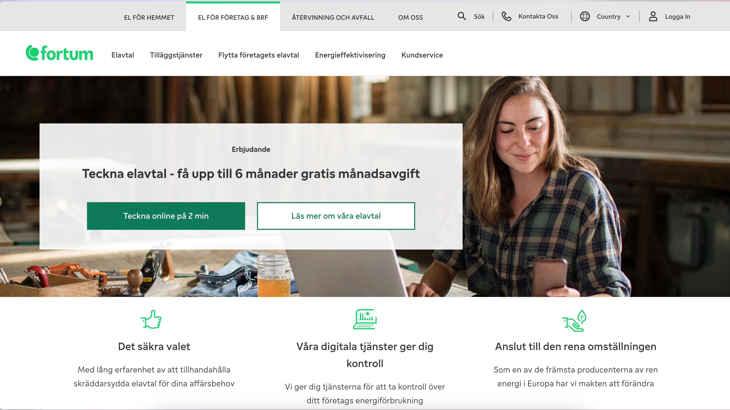
"Our current customer service page lacks structure. It is hard for users to find the content they need, and the content is often hard to understand, as we can only use text. It is not possible to link to questions if we need to refer them elsewhere."
Duration
3 Months
Platform
Web and mobile app
My Role
My primary responsibility as the UX designer was to research, understand and design a better solution for the customer service page that met both stakeholders and users needs. During the period, I interviewed stakeholders, prototypes and tested the first sketches and finally delivered the project with all technical requirements.
Goals
Create a customer service landing page offering access to all service-related material (sub-pages) and a clear starting point for the resolution journey.
Shorten the resolution journey with quick access and enhanced search capabilities.
Shorten the resolution journey with quick access and enhanced search capabilities.
Design Process
For this project, I began by understanding the business needs. Since the primary stakeholders were customer service representatives, it was easy to empathise with the help center's end users. Next, I researched best practices and explored how different products design their help centers. Using these insights, I created initial sketches, which were tested internally. Based on the feedback, we refined and finalized the designs to ensure they met both user and business goals effectively.
Low Fi Wireframes
Interviews
During the design of the FAQ and digital response service, I conducted 12 interviews with internal collaborators.
As a way of rapidly testing and iterating on the design, I started using two techniques to recruit interviewees - Microsoft Engage and Test booth in the cafeteria.
For any project that does not require a very specific profile of tester, I started using these methods to make my work more agile.
Key take aways from interviews:
- The overall experience was good
- The main function is the search bar – some people would use key words, some people would use full sentences
- The trending topics was not used a lot – users suggested to use keywords or short sentences
- Shortcuts with icons help a lot
- News cards were not well received – several suggestions were made
Concept
Our concept involves creating a user-centric help centre that consolidates all service-related material. This redesign will feature a clean and logical layout, ensuring a seamless pathway for users to navigate and find relevant information. We aim to incorporate imagery and iconography to enhance the visual appeal and guide users through their resolution journey.
The search enables users to use keywords and phrases to find information easily and quickly. The trending questions will help users finding the current most common issues, while the popular topics will guide users to common topics they can be interested in and also gives them the opportunity to find how to contact us.
The concept addresses the need to optimise content organisation within sub-pages. In instances where content is dense, we propose implementing sub-categories and quick links to facilitate the efficient retrieval of information. This approach aims to improve the overall user experience by providing users with a clear structure and easy access to the information they seek.
In summary, the concept revolves around creating an intuitive, organised, and visually engaging help centre page that not only serves as a centralised hub for service-related content but also streamlines the resolution journey through effective content organisation, quick access features, and improved search capabilities, empowering the customers to help themselves and reducing calls to customer service.
